Product listings page
18. Argos – same-day delivery in faceted nav
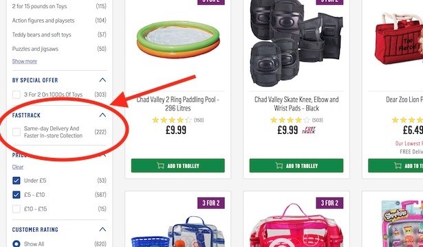
Late buying that birthday present? Argos and its faceted navigation allows you to filter only those products that are available for same-day delivery or faster in-store collection. Life saver.
19. Best Buy – local store pick-up filter (prominent on mobile)
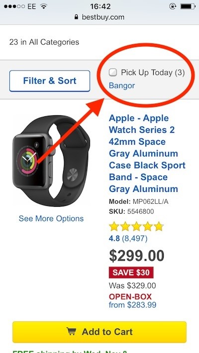
Best Buy’s faceted navigation gives lots of options, but on mobile only one is surfaced outside of the filter menu and ready for me to select with one tap. Yep, it’s the ‘pick up today’ filter, which is customised to my nearest store. By tapping this when I’m on the go, I can quickly see which products I can reserve near me. Vital for those in a rush.
20. Rentalcars – sticky filter
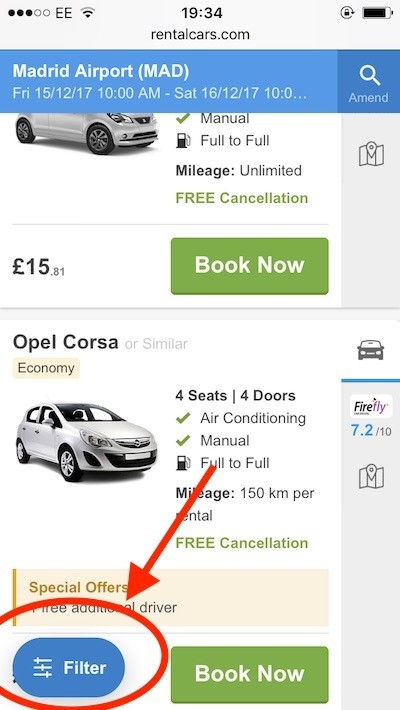
A nice way on mobile to allow the user (and their thumb) to quickly reach the filter results button – Rentalcars uses a sticky button on the bottom left, ever-present as I scroll through.
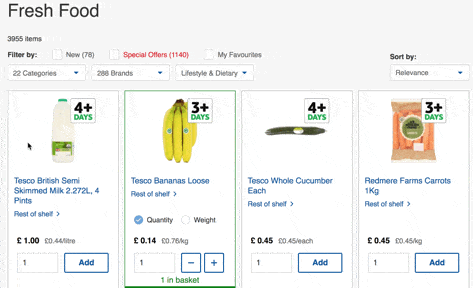
21. Tesco – ‘Rest of shelf’ button
When shopping for groceries online, finding products is a pain because users often have to use a many-branched menu, clicking through many categories before they find the product they want. Of course, there is the search bar and usually a list of previous purchases, but there should really be a more elegant and visual solution.
Tesco has just that on its newly updated website. I can scroll through larger catogories (such as the entirety of ‘fresh food’) and when I see something vaguely familiar I can click ‘rest of shelf’ and view products that live on the same shelf in-store.
This small feature is a wonderful way of linking offline shopping behaviours with online behaviour. See the example below with milk.
22. Best Buy – ‘notify me’
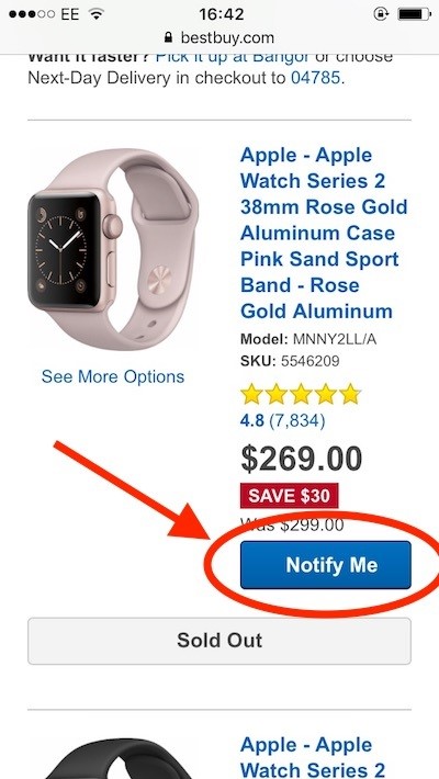
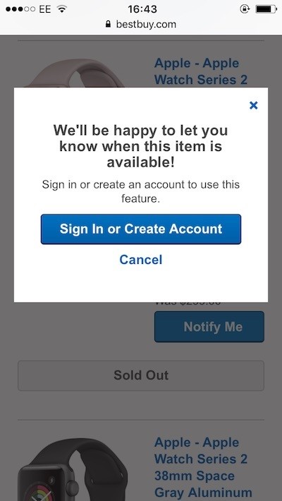
Best Buy’s product listings sometimes contain products currently out of stock, such as this Apple Watch. Rather than disappoint the customer, the retailer changes its ‘add to cart’ button to a ‘notify me’ call to action. Customers can then enter they email address and wait for Best Buy to let them know when they are available.
23. Booking.com – faceted navigation tool-tip
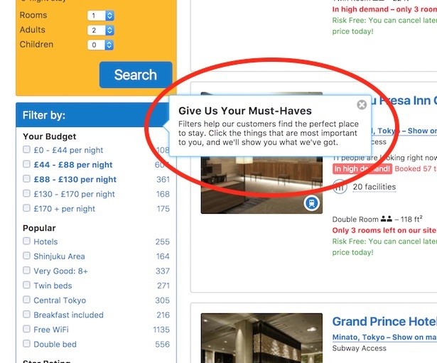
When I saw this tool-tip on Booking.com I wondered why I hadn’t seen similar examples before. After all, we mustn’t assume that there’s such a thing as intuitive web design. New users might need an extra prompt to narrow down their hundreds of search results.
The tool-tip says ‘Give us your must-haves. Filters help our customers find the perfect place to stay. Click the things that are most important to you and we’ll show you what we’ve got.’
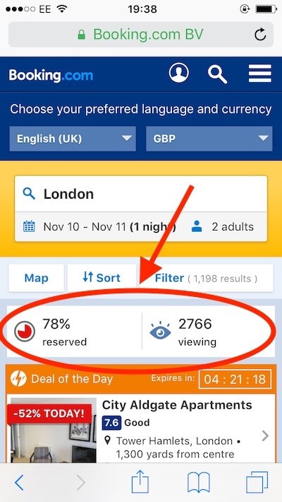
24. Booking.com – real-time social proof
More from the ‘chatty’ UI that is Booking.com. On mobile my product listings page told me what percentage of rooms on my selected dates had been reserved along with how many other people were viewing this search.
I must say, the little red pie chart of reserved rooms was quite the prompt to get on and book.
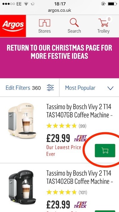
25. Argos – add to cart from product listings page
I love the way Argos product listings pages allow you to add each product to your cart with one tap of this button, without having to click into the product details page. Not every retailer does this.
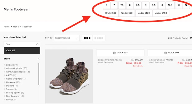
26. Size – quick-select faceted navigation
Here’s a feature that is creeping into more and more product listings pages. Rather than having to use the fiddly faceted navigation on the left hand side (which often involves small checkboxes and little scrollers), I can use the popular facets surfaced at the top of the page.
These are bigger buttons allowing me to narrow down to a particular size or a price ceiling. Let’s be honest, these are the two things shoe browsers care about most.
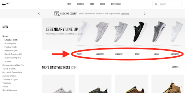
27. Nike – illustrated faceted navigation
On a similar theme to the Size example above, Nike understands that some models of its trainers are iconic enough to merit an image and a button at the top of product listings pages.
In the shot below, I’ve selected ‘lifestyle’ shoes in the site header menu, which has taken me to this listings page, where I can pick an Air Max from the top menu if I want to focus only on these. It’s a useful addition to the traditional faceted navigation and a lesson for all sports brands selling direct to consumer.
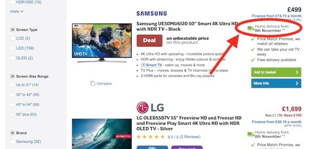
28. AO.com – delivery date in product listings
There’s plenty of information in AO.com’s product listings, and none as important for some users as a delivery date. Particularly in the run up to Christmas, shoppers want to know that their fridge/TV/washing machine will turn up on time.
The lorry icon and a delivery date help to reassure the customer that AO.com is the right choice for prompt delivery.
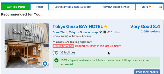
29. Booking.com – ‘in high demand / latest booking’ hover effect
One of many examples of social proof that Booking.com uses to give the user some pep. A red warning tells me when a listing is in high demand and how many times it was viewed in the last 24 hours. If I scroll over this information I’m also told when the latest booking at this hotel was made. Persuasive stuff.
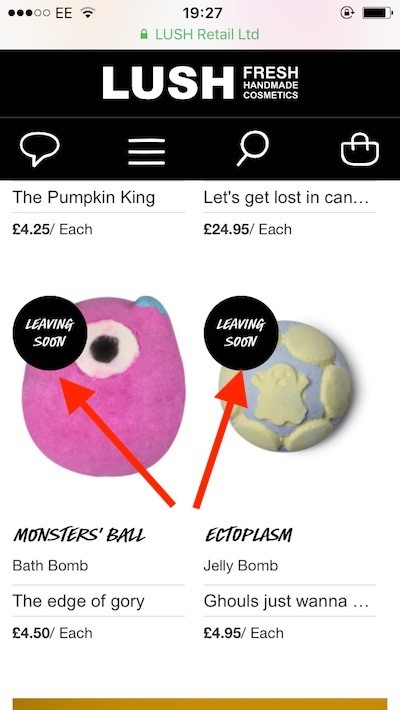
30. Lush – ‘Leaving soon’ stickers
A simple touch here, but one done well. Lush adds characteristic black and white stickers saying ‘leaving soon’ to its seasonal products such as halloween soaps. These messages can help to add a sense of urgency to the repeat shopper who may be fond of a particular seasonal product.
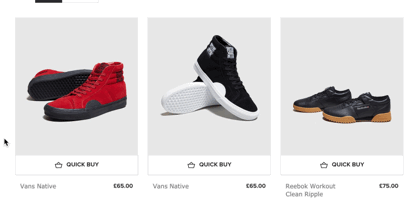
31. Size – product image hover effect
Hover effects on product listing pages have been around for a number of years, but that doesn’t mean they are always used effectively. In this case, I love what Size does with the hover state.
Not only am I offered different angles to view the product from, the fact they are portrayed sat atop their box almost feels like a little psychological ploy to make the user imagine unboxing the product at home.
32. Everlane – detail hover effect
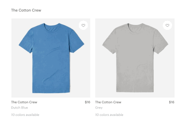
I’m also a fan of hover states on apparel ecommerce sites which do something a bit different. Everlane sells quality clothing and so takes care to show a product detail when I hover over the full image. Yes, there are no model shots here, which some may see as an issue, but I like how this photography puts emphasis on material and shape, rather than an overall look.
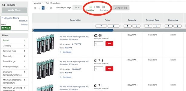
33. RS Components – list view or grid view
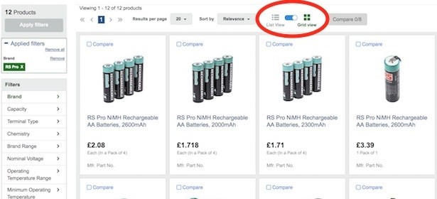
RS Components has so many different types of products that one view of product listings won’t suit everything. So, for more complex products, users can select ‘list view’, allowing them to sort by a number of different criteria.
For quicker scanning, users can switch to the more common grid view that one would see in ecommerce.
34. AO.com – customer counter
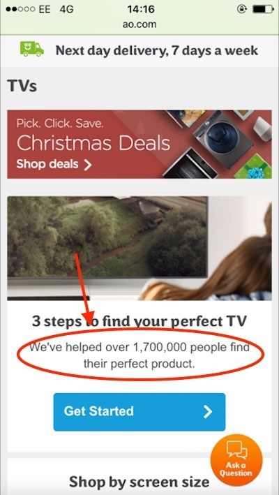
For online pureplays like AO.com, convincing customers to buy something for the first time without experience of a high street store could be a challenge. That’s why the appliances retailer takes the opportunity to display its credentials where it can, including telling users how many customers they have helped.
The shot below is taken from the TV category page, where AO.com states how many people have used their product guide.
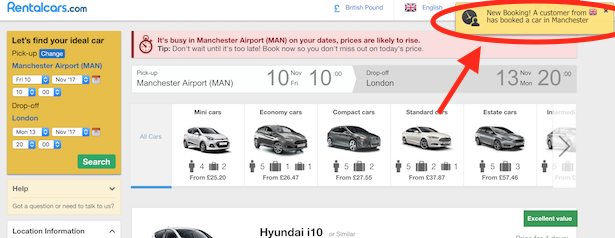
35. Rentalcars – new booking notification
This may annoy some users, a message that pops up every time a customer in my location books a car. Equally, it does show how popular and likely trustworthy is the site.
36. Rentalcars – product tool-tips
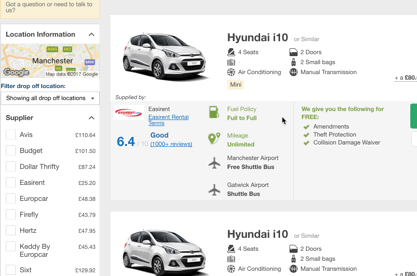
Hiring a car can be an exercise that involves plenty of customer questions and some small print, too. Rentalcars makes sure it gives users as much information as possible on its product listings pages, with tool-tips appearing on pretty much every bit of copy. For example, when I hover over ‘collision damage waiver’, a tip appears saying “If the car’s bodywork gets damaged, the most you’ll pay is the damage excess.”
37. AO.com – curated ‘best products’ landing page
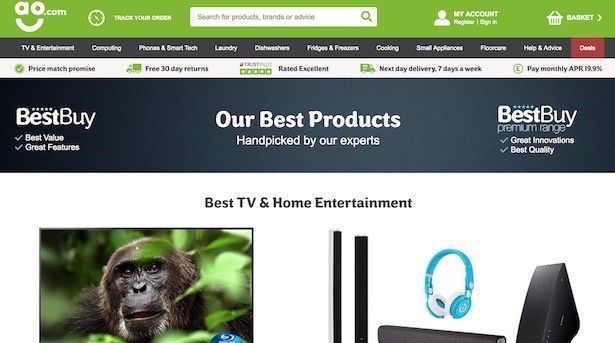
What a simple idea – a page showing AO.com’s best products as picked by AO.com experts. This is a feature that Currys PC World, for example, seems not to provide on its website.
38. Booking.com – green text emphasising ‘risk free’ purchase
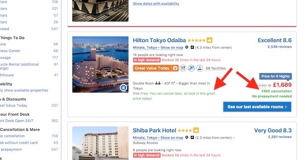
Booking.com can appear to be a tad on the bright side with its garish mix of font colours, but they all serve a purpose and have no doubt been thoroughly tested. The one I like best is the use of green text saying “Risk Free” and “FREE cancellation”. This shows the customer at a glance that they can book now and repent at their leisure.
39. The Trainline – ‘Cheapest’ sticker
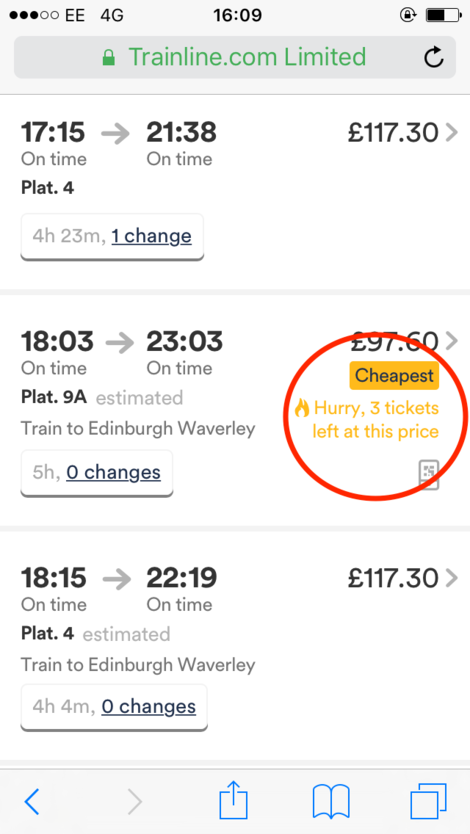
You’re shopping for travel tickets, be it plane, train or coach, and you really want a good listings page and the ability to find the cheapest seat at your convenience. Whilst the world of UK trains isn’t renowned for this kind of transparency, The Trainline does at least use a ‘cheapest’ sticker and a message telling me how many tickets are left at this price.
