Product details page
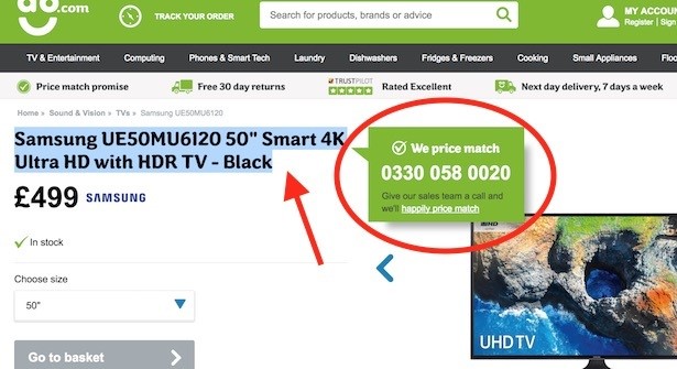
40. AO.com – dynamic price match promise
You may be familiar with this – it’s one of the most famous interactions in ecommerce. Block a product title on AO.com as if you are about to copy and paste to Google and you’ll be shown a price match message encouraging you to call AO.com and tell them if you can find the product cheaper. Ingenious.
41. Argos – sticky add-to-cart button
Watch as I scroll down an Argos product details page, and the add-to-trolley button sticks to the top of the page, allowing me to throw it into my bag without having to waste precious seconds scrolling back up again.
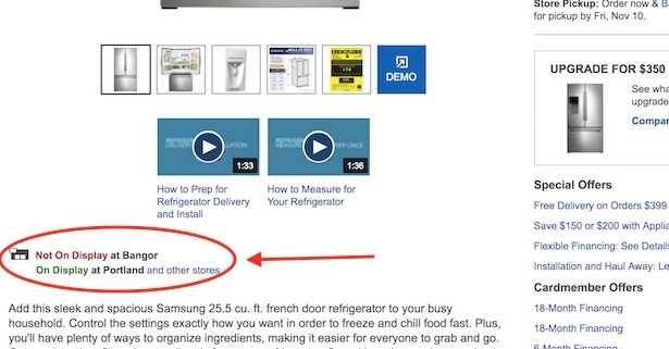
42. Best Buy – product “on display at…”
Customers may want to check local store stock, but equally with a considered purchase they may want to know if the product is on display at their nearest store. Best Buy lets the customer know with a message below the product photos. If it’s not on display at your nearest store, you’ll be given the next nearest option.
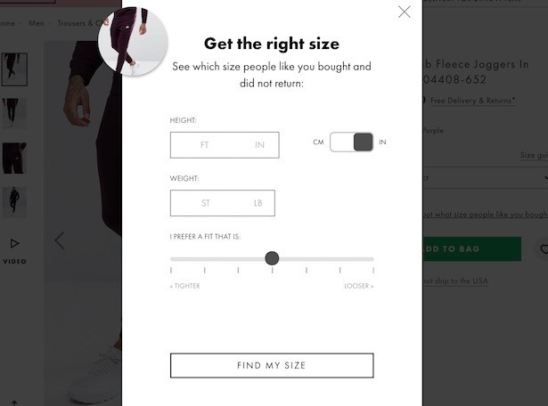
43. ASOS – interactive size guide
Too many websites offering boring, large and potentially difficult-to-use sizing charts. Not ASOS, which gives me this lightbox where I can fill in my height and weight (in metric or imperial) and how tight I like my clothes. The tool will then return the sizes right for me – no sifting through data.
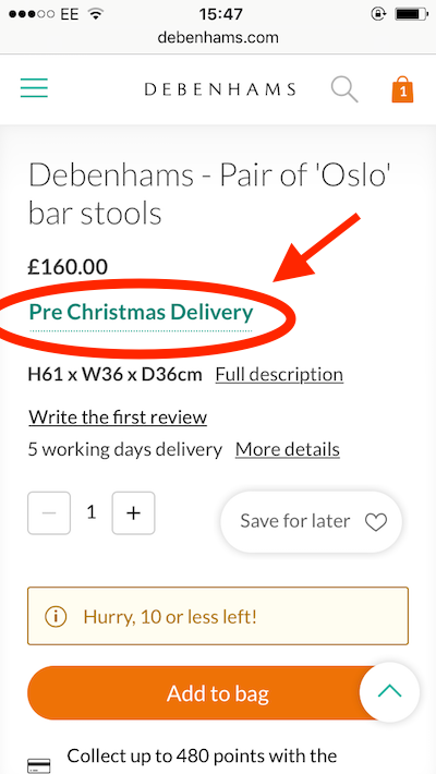
44. Debenhams – ‘Pre-Christmas Delivery’ message
Approaching the Christmas rush, Debenhams product details pages have a prominent green message which tells me an item is available for pre-Christmas delivery. Great for encouraging a confident add-to-bag.
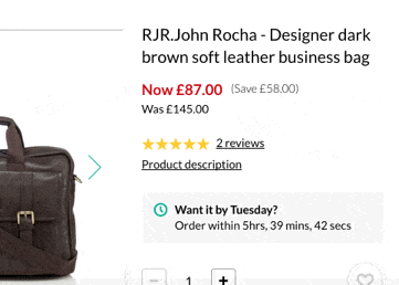
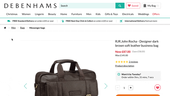
45. Debenhams – ‘Want it by tomorrow?’ order countdown
Most retailers offering next-day delivery require customers to order before a particular time of the day. Debenhams knows that highlighting this using a countdown timer will encourage indecisive users to purchase sooner rather than later.
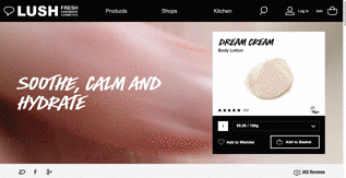
46. Lush – hero product video
I’ve long championed Lush (see here and here). One of my favourite features in its website is the use of hero video at the top of product pages. For my money, it puts all competition in the shade with this one authentic use of rich content. It also shows the product in action, so the customer knows what to expect.
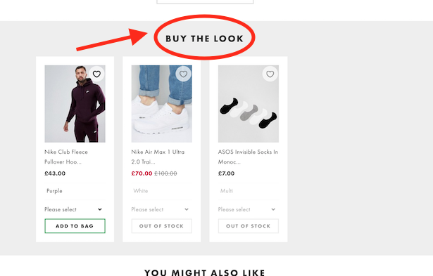
47. ASOS – ‘Buy the look’
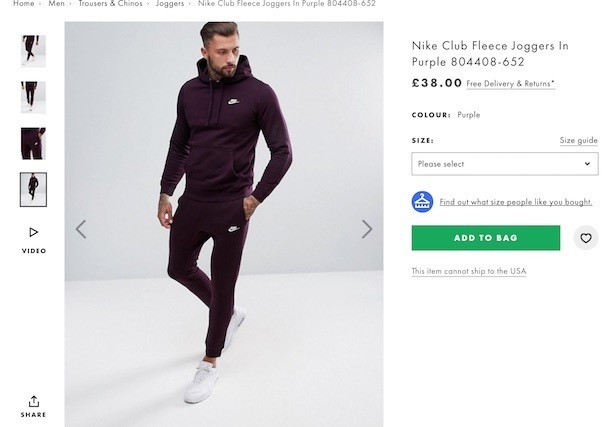
Here’s another feature that has long been talked about in ecommerce but rarely carried through with the simplicity and success that ASOS has managed here. Yes, there are some products out of stock in this example, but it’s still a feature that squeezes extra value out of stylish product/model photography.
48. Airbnb – reassuring micro-copy
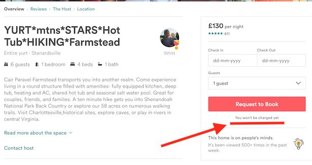
How the tiniest things can just tip the customer in the right direction. Here, Airbnb uses small copy saying “You won’t be charged yet” to encourage customers to click the ‘Request to Book’ button without fear of immediate financial consequences.
49. Argos – ‘X others have looked at this….’
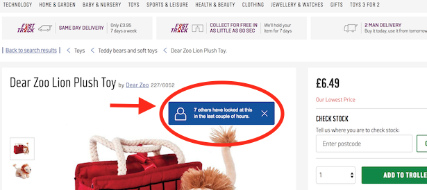
A common tactic among retailers and functionality that is available in most ecommerce platforms – dynamic messages appear for a few seconds when I land on a product details page, telling me how many have viewed or bought this item recently or are looking at it right now.
50. Debenhams – alternative ‘breadcrumb’
Those customers who haven’t found what they want on a product details page should always been given a quick and easy route back to browsing. This can often be via the main header menu, or by using the breadcrumb trail (e.g. Men – Shirts – Short Sleeve). Debenhams, as shown in the GIF below, also adds some category options, an alternative breadcrumb, if you like, below the product. This is a very helpful feature for customers to delve back in once again.
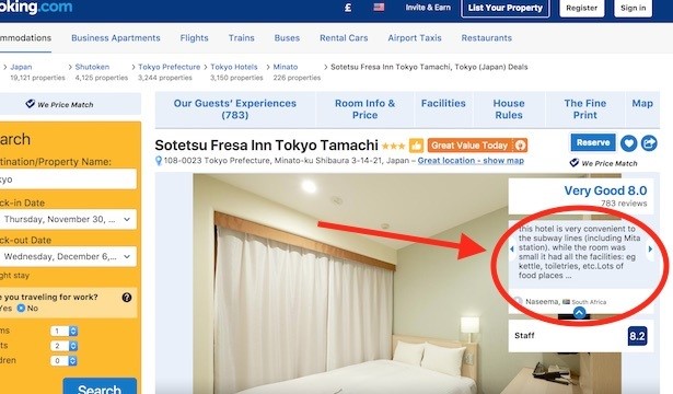
51. Booking.com – user review carousel
Reviews are incredibly important for people booking a hotel room. So why not make them hard to miss? Booking.com includes a carousel of reviews inset within the product photography carousel. This way, as you review the photographs you can’t help but notice glowing reviews of service, location and facilities.
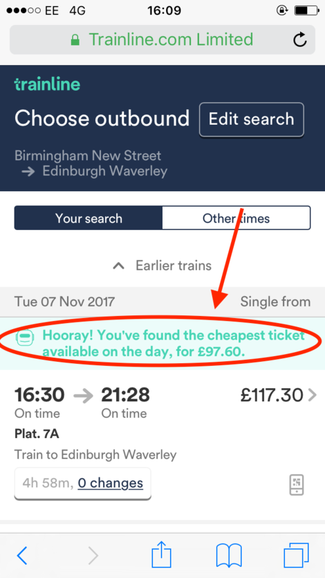
52. The Trainline – ‘You’ve found the cheapest ticket’
For some travel sites, it’s important to make customers on listings pages aware of which product is cheapest, but it shouldn’t stop there, a message should be displayed on product pages, too. The Trainline does this nicely with a friendly “Hooray!”.
(Correction: This is actually on the search or product listings page as you can tell because the cheapest price doesn’t match the price below, it corresponds to the ticket above which I would have to scroll up to view. Still, a handy feature nonetheless.)
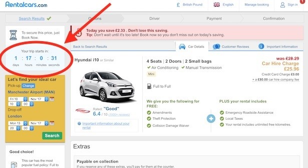
53. Rentalcars – trip countdown
What better way to instil urgency in the customer looking for a hire car than displaying a timer inexorably counting down until the start of their trip.
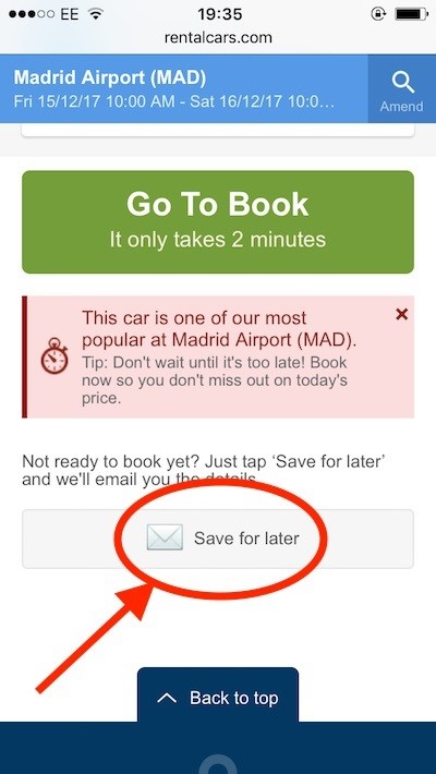
54. Rentalcars – ‘Save for later’ email
Rentalcars lets users send themselves an email with all their selected product details, helpful for those who aren’t quite ready to book but don’t want to go through the rigmarole of search all over again.
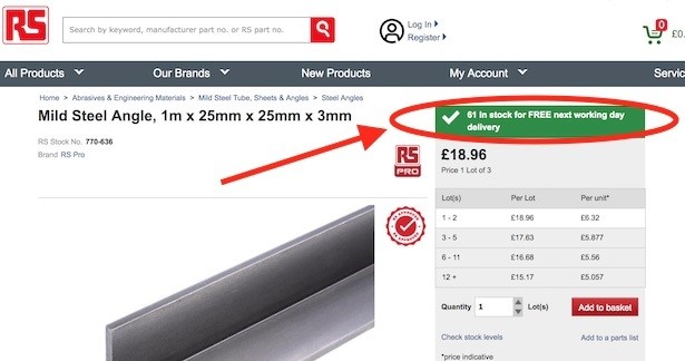
55. RS Components – warehouse stock counter
Trade buyers may need quite a number of a particular product from RS, so the ‘catalogue’ company provides accurate warehouse stock numbers so customers know if their order can be fulfilled.
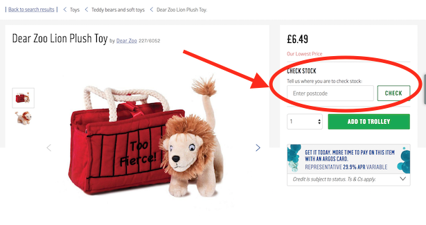
56. Argos – check stock in store
No self-respecting multichannel retailer will miss the opportunity to let customers check their local stock, should they want to purchase in-store or reserve an item.
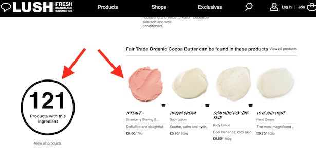
57. Lush – cross-sell by ingredient
Each product contains an illustrated list of ingredients, some of which have their own ingredients page which users can click through to. Once on an ingredient page, I can see every product that Lush sells which contains said ingredient. A really neat way of bringing educational content back to commerce.
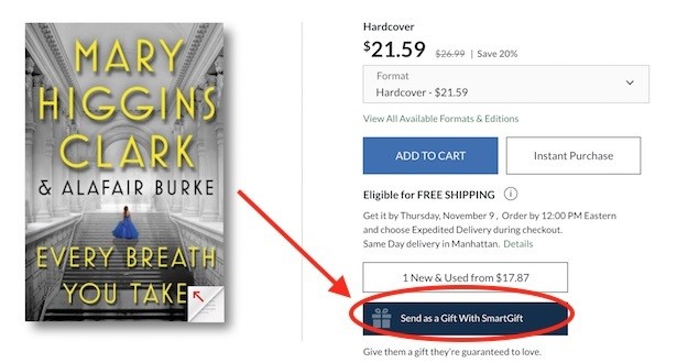
58. Barnes & Noble – send as gift
I had never come across SmartGift before. It’s a service which allows the user to send a gift link whereupon the recipient can accept or exchange online for any same or lower-priced item. The gifter will pay only once the recipient has accepted.
A great tool for no-hassle gifting.
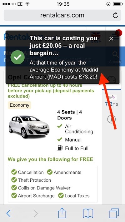
59. Rentalcars – ‘bargain’ popup
More persuasion from Rentalcars, this time on mobile featuring a fairly intrusive message but one that tells me I’m saving a heck of a lot of money (compared to average prices at this time of year).
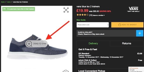
60. Schuh – 360-degree product photography
I can choose a set of product images on Schuh if I want, but the default view is this drag-to-spin 360-degree imagery which lets me view the shoe from any angle.
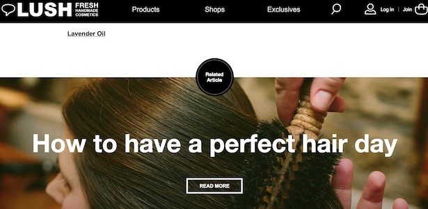
61. Lush – related article
Combining content and commerce is a hot potato. Does it distract the user from purchase? I would argue that for a multichannel brand, the goal is to engage with and educate the consumer as much as possible, placing your brand as the premier destination for shopping and browsing. Lush does this with a related article at the bottom of most product pages, as well as plenty of content on the homepage.
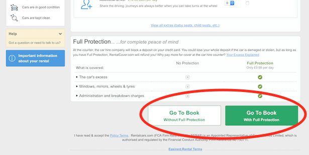
62. Rentalcars – double CTA
I debated whether to include this. Arguably it’s a dark pattern with the customer perhaps clicking to add full protection for £9.98 without actively wanting to (if they’re not paying attention). I’ve included it just to show it goes on, and because for all the moral questions this kind of UX throws up, I’m sure there have been plenty of customers who were glad they unwittingly chose full protection. Complaints on a postcard.
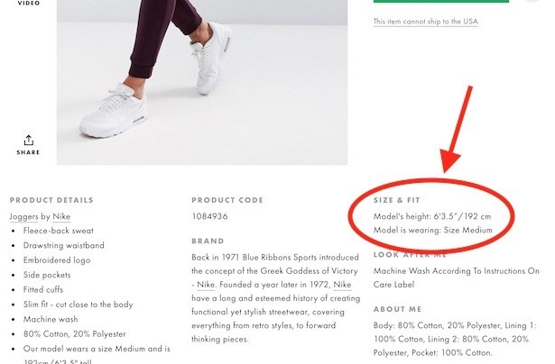
63. ASOS – model size and fit
Want to know whether clothes will fit right? Size guides are helpful, but so, too, is product photography. Telling customers what height the model is, as well as what size they are wearing can help the customer decide on what size to purchase.
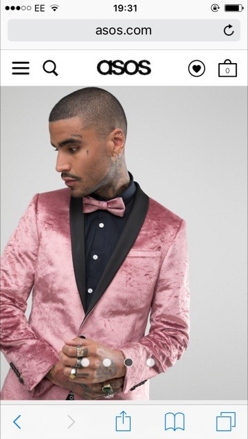
64. ASOS – full-screen product imagery
This has been best practice on small mobile screens for a while, but it still impresses me and is one of the most impactful changes a retailer, particularly in apparel, can implement.
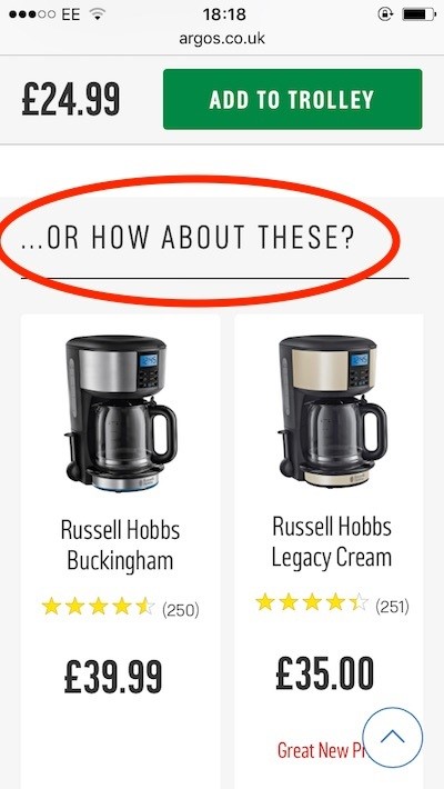
65. Argos – clever product recommends copy
A simple but elegant bit of copywriting from Argos. The product recommends feature towards the bottom of the product page uses the copy “…or how about these?”, which acknowledges the fact that the customer is likely to buy only one item from this category (coffee machines). The choice of phrasing shows a good understanding of customer mindset during the browsing stage of their journey.
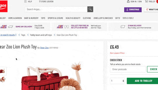
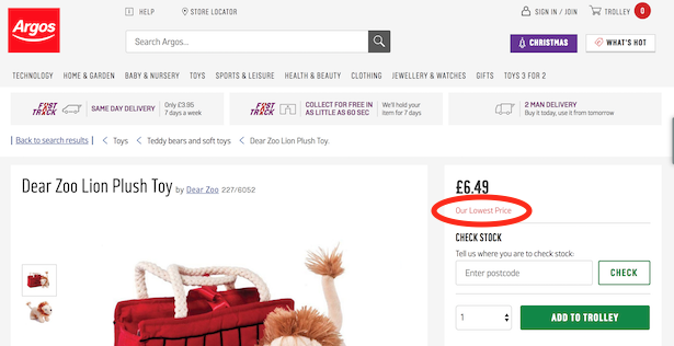
66. Argos – ‘Our lowest price’
A very simple but very persuasive bit of copy on this Argos product details page. “Our Lowest Price” let’s the customer know the retailer has never charged more for this item. Perhaps not a revelatory claim, but psychologically it makes the customer think they’re getting a price that’s unlikely to be better elsewhere.
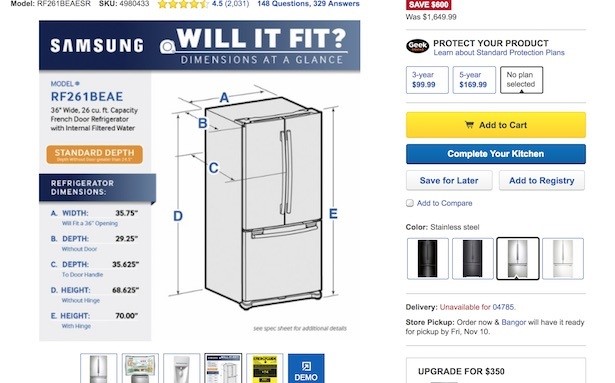
67. Best Buy – instructional product photos
Why rely on the customer poring over the product specification to find the vital information they need about a fridge freezer’s dimensions? Best Buy uses instructional content from the product manufacturer in its product photos carousel. This way, customers can see exactly what they need to measure.
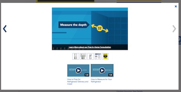
68. Best Buy – instructional product video
Best Buy uses instructional videos in the product imagery carousel. In this example, I’m carefully walked through how to measure up, to make sure I don’t buy a fridge that doesn’t fit my kitchen. This type of content is part of the effort to reduce costly product returns and make sure the customer is happy.
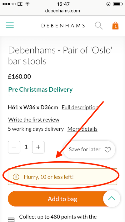
69. Debenhams – ‘Hurry, 10 or less left!’ low stock message
Though customers are getting more savvy when it comes to urgency tactics such as ‘one room left’ when browsing hotel aggregators, this tactic can still be very effective in ecommerce when used responsibly. Here, Debenhams tells the consumer when there are 10 or less of a product in stock. If you have a realtime overview of stock levels, why not use it to keep the customer informed.
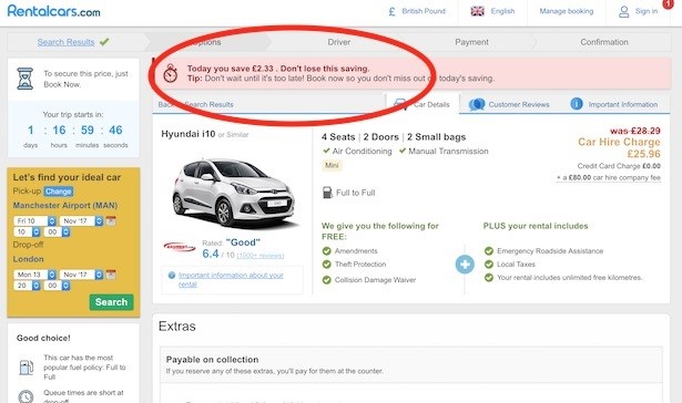
70. Rentalcars – ‘Don’t lose this saving’ banner
More urgency-inducing messages from Rentalcars. All I want to do now is get this car booked.
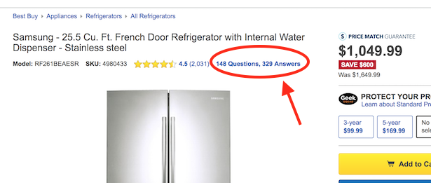
71. Best Buy – prominent product Q&A
Lots of product details pages use question and answers, particularly for technical products, such as electronics or white goods. I particularly like the way Best Buy highlights the Q&A content alongside its average customer review rating, right at the top of the product page. This is key information and can make the difference between sale and no-sale for those customers who are sticklers for finding the perfect product.
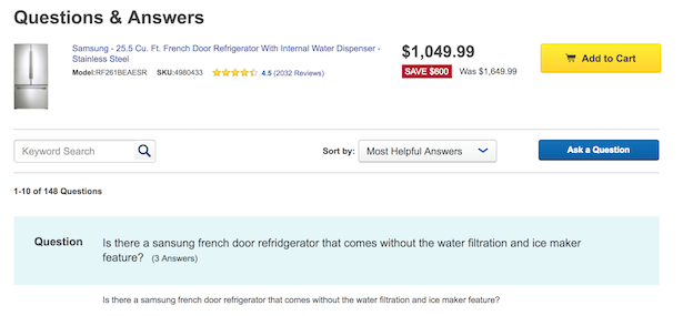
The Q&As themselves can be sorted (defaults to ‘most helpful’) and searched.
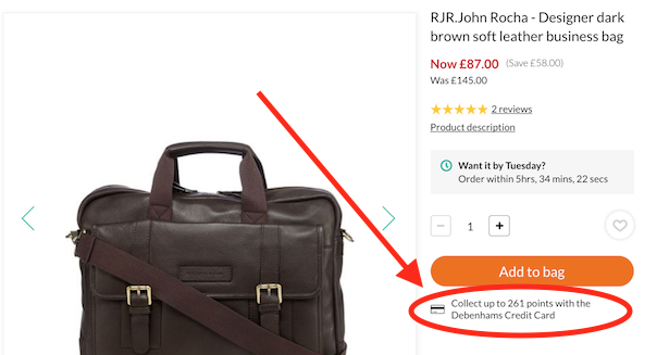
72. Debenhams – ‘Earn points with this purchase’
A dynamic message under the add-to-bag button on product details pages tells the customer how any points they will pick up if they had a store card or loyalty card. What do points make? That’s right, prizes.
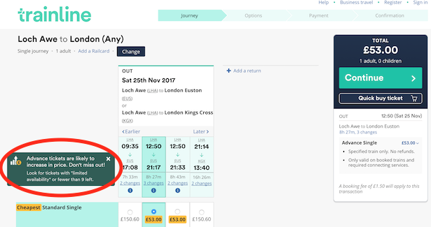
73. The Trainline – price increase warning
It’s worthwhile letting febrile ticket shoppers know that if they wait, prices may increase. The Trainline does this with a pop-up message saying “Advance tickets are likely to increase in price” and to “Look for tickets with ‘limited availability’ or fewer than 9 left”.
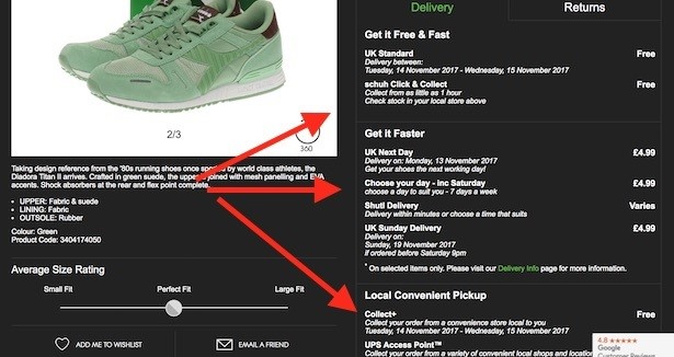
74. Schuh – front-and-centre delivery info
On no other product page did I see delivery information turned into such a virtue as on the Schuh website. It makes sense though, the customer is made aware they can get almost instant fulfillment through Shutl or Click & Collect, they can pay for Sunday delivery or choose a particular day. There are Collect+ and UPS Access Points available, too. This is customer experience that walks the walk.
