Bag / basket / cart
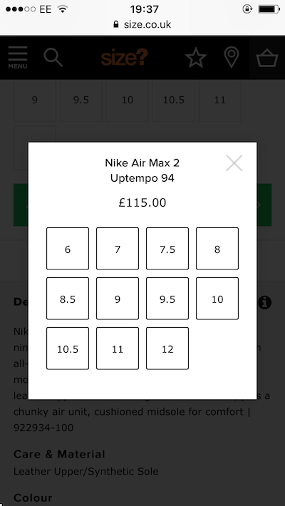
75. Size – size-select lightbox on add-to-basket
I really like the UX on Size’s site on mobile when I forget to select a size before adding a product to my bag. This lightbox style size-select flashes up and I can quickly tap the size I want.
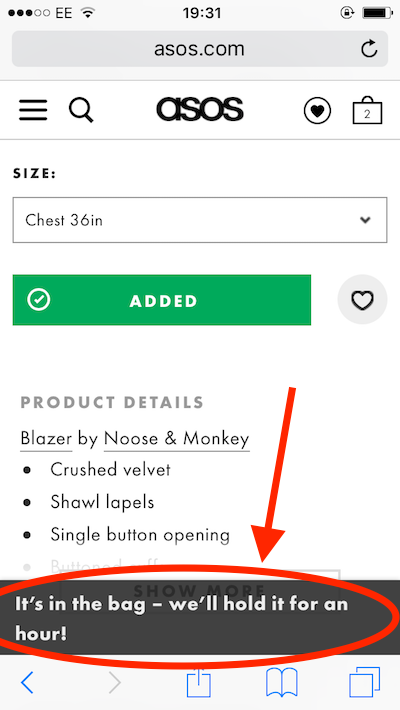
76. ASOS – bag time-limit pop-up
Make sure users know how long their chosen item will be held in the bag for. ASOS does this with a little pop-up telling me I’ve bagged it and it’ll be held for an hour.
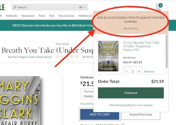
77. Barnes & Noble – “add $X of eligible items to qualify for free shipping”
The Barnes & Noble cart tells me just how much extra I have to spend to get my order shipped for free. A lovely incentive to buy more books.
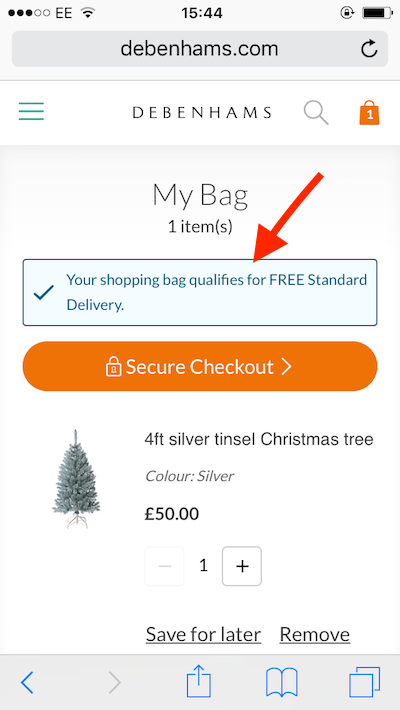
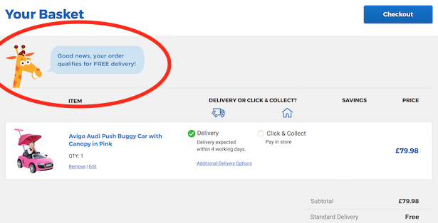
78. Debenhams & Toys R Us – ‘Your shopping bag qualifies for FREE Standard Delivery’
Don’t leave a customer wary of delivery charges, let them know in the cart/bag, before they get to checkout, that they qualify for free delivery. Debenhams does this with a chunky blue message including a blue tick and the hard-to-miss ‘FREE’.
Toys R Us is even better. The retailer uses its mascot Geoffrey to delivery this free delivery message. A brilliant use of the brand to draw attention to a kew message.
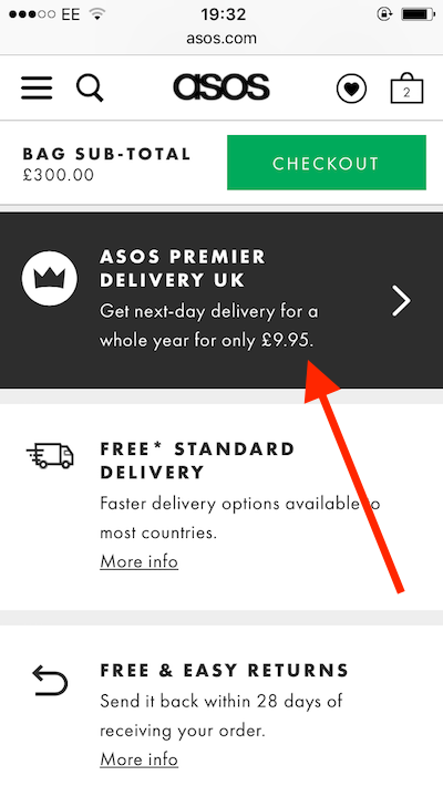
79. ASOS – next-day delivery subscription
Why should it be just Amazon that hooks customers into a subscription to next-day deliver? ASOS offers the service in the bag for £9.95, a great way to please your most loyal of customers.
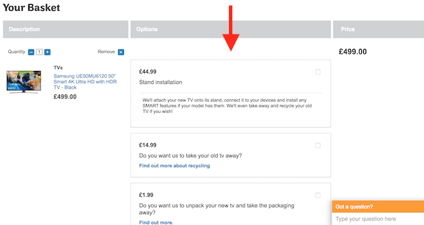
80. AO.com – service up-sell in basket
I love the way AO.com will bundle in lots of services with delivery for those customers who want to eliminate hassle. When buying a TV for example, I’m offered stand installation, old TV removal and unpacking.
81. AO.com – complimenting the customer’s taste
The AO.com basket also includes this very simple message telling me I’ve “got great taste” and am “getting one or [their] best offers”. A lovely touch. No reason not to checkout.
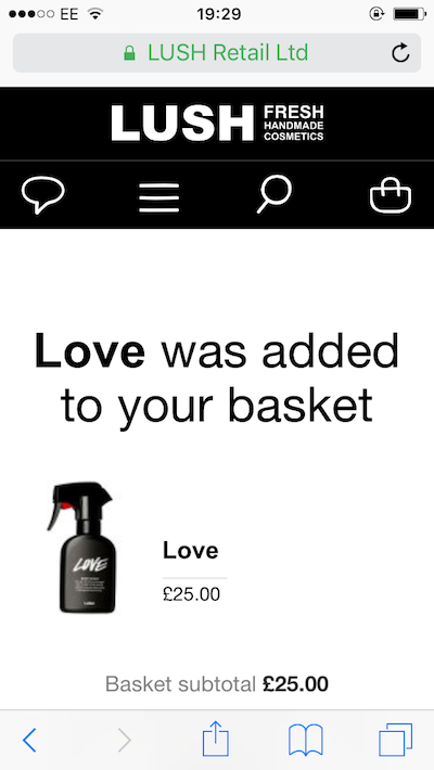
82. Lush – full-page add-to-basket message
The whitespace and imagery on the Lush website makes it a joy to browse. Even this simple full-page add-to-basket notification made me feel special.
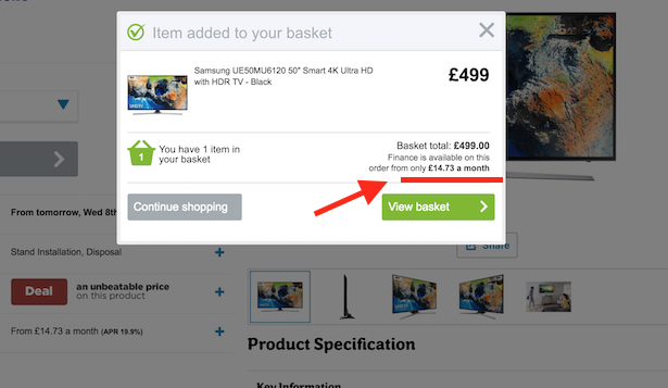
83. AO.com – finance and up-front price in add-to-basket
If customers are having second thoughts when they add a big ticket item to their basket, AO.com provides a monthly price in the add-to-basket message. Finance options are shown on product listings pages and product details pages, but it doesn’t hurt to reiterate the option in this add-to-basket message.
Checkout
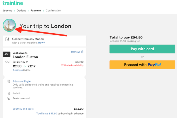
84. The Trainline – cute customised thumbnail
Look at this! The houses of parliament in a cute little thumbnail as I pay for my trip to London on The Trainline. I’m already excited about my trip.
85. AO.com – anxiety-killer delivery info
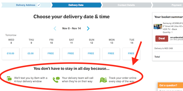
“You don’t have to stay in all day because…” – AO.com gets straight to the nub of its excellent delivery service. The information below tells me when I’ll receive a text message, how long my delivey window will be, that I’ll receive a call and that I can track my order any time I want.
86. AO.com – contact number in checkout header
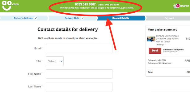
A common sight in the best checkouts, the contact telephone number suddenly appears front and centre in the header menu. Any wavering customers can call to clairfy an issue rather than falling our of the checkout.
87. Barnes & Noble – form field reminders
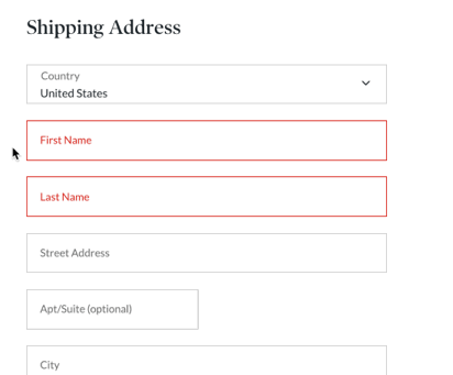
Another bit of best practice that nevertheless isn’t always implemented. When I click into a form field, it’s title remains, shifting up slightly to let me type. This way I am less likely to make an error.
88. AO.com – privacy reassurance
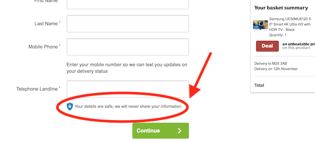
The GDPR has put privacy concerns more firmly on the agenda for many companies. This is only a small feature, but it’s increasingly common to see a promise under a telephone number field that a company will never share customer information.
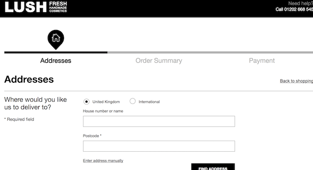
89. Lush – checkout progress bar
One of the core tenets of a usable and converting checkout is a clear progress bar. None clearer than Lush’s.

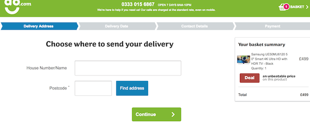
90. AO.com – chunky, focused form design
Throughout the AO.com checkout, form fields are chunky and easy to select, with relevant buttons close by and similarly chunky. Compare with Lush above (which isn’t that bad itself).
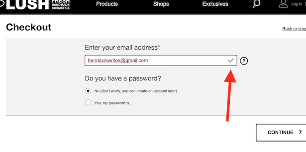
91. Lush – email field validation
Another bit of best practice. Do you validate email addresses with a nice green tick so customers know they have put dots and @s in the right places?
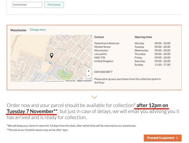
92. Debenhams – firm date and time for click and collect
One of the uncertainties for customers when they use click and collect is whether their item will arrive on time. Some retailers say ‘1-3 working days’, leaving the user waiting for a notification and hoping it will be one rather than three. Debenhams counteracts this unease by very clearly giving the customer a date and time by which their parcel should be ready for collection.
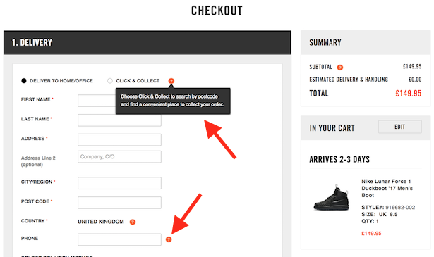
93. Nike – tool-tips
And finally, more tool-tips, this time from Nike. They don’t add startling useful information, but enough to help new or unsure users.
