What Is a Rainbow Chart? 🤔
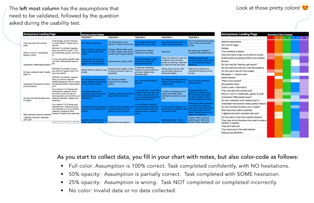
Rainbow charts are a structured way of setting up and documenting usability tests. Also, they are great when you have so many insights that a Costco sized post-it box won’t cut it. Here’s what they look like:

What Makes Rainbow Charts So Magical? ✨
I get it, why go through all the work to collect your research findings like this when you already have methods in place? Here are my top 5 reasons:
- Promotes agile/lean thinking
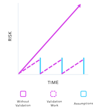
The structure of rainbow charts encourage you to test risky assumptions early, allowing you to move forward and fast in the right direction. By listing out all your assumptions, you can be deliberate and prioritize testing the riskiest assumptions to avoid massive mistakes.

Image credit: UXhoney.com
2. Ensures thoroughness
Because the assumptions column is right next to the question/task column, you can ensure you are asking all the right questions to answer your pre-defined objectives. Also, it’s easy to forget to ask a question during the usability test, unless you have it clearly written down. This also goes with documenting responses. Often we accidentally forget to write down a key insight and later realize that we don’t know the user’s response, or if he/she responded at all. By using an excel spreadsheet/table where all the cells are shown, you are held more accountable to document your data.
3. Strengthens arguments
3. Often when presenting findings to stakeholders or engineers, researchers don’t remember every single detail and can appear flustered when put on the spot. This only makes people devalue their work even more. Because of how the rainbow chart is laid out, the data is visual for clear processing, but you can also easily refer back to the exact data as needed. You appear thorough and prepared. This also strengthens the relationship with people who are skeptical about research because you are being transparent with your findings in a way that is easy to understand.
4. Favors action
Using quantifiable data not only makes for a more compelling argument, but also reveals clear actionable direction for the design. With such a visual report, it really exposes what needs to be prioritized in order to fix the glaring missed targets.
5. Enables more collaboration to drive success
When you are developing your assumptions list, give everyone the opportunity to suggest things to test. Allowing everyone’s curiosity to be filled and getting different perspectives on what assumptions need validation is a good way to get buy-in and quality results. Also, by forcing the researcher to bucket the responses into 4 categories when synthesizing the results (success, semi-success, fail, or invalid/no data collected), it keeps the process of collecting data very objective. Anyone and everyone can do it!
To Conclude 🌈
If you want to advocate for research and bring value to your team, be smart, thorough, organized, transparent, and collaborative. By doing these things, and by using tools like rainbow charts where the process is clear and the results yield rationale and actionable steps, you will be able to gain more respect for research and be able to move closer to success, together as a team.
Thank you for reading! I hope this helped you think about ways you can advocate for research and make an impact in your company. If you’d like to nerd out on process and research methodologies, I’d love to meet up! Iterating on processes to grow as a designer and as a team is my jam.
Helpful Resources 💁
Pro-tip: To maximize efficiency use shortcuts to easily change cell colors.
- Select all the cells you will input data into. (All the cells if you want it monochromatic, or all the cells in the column if you want each column a different color of the rainbow.)
- Click “Fill color” (the paint bucket) and click “Conditional formatting…”
- Change the formatting rules so that “If the text starts with ___” it will be a specific color. I used Y (yes), H (half), N (no).
- Here’s a template you can use if you want everything pre-set. Make a copy of it so you can edit it for yourself. Enjoy!


