Homepage
1. Best Buy – local store hours in header
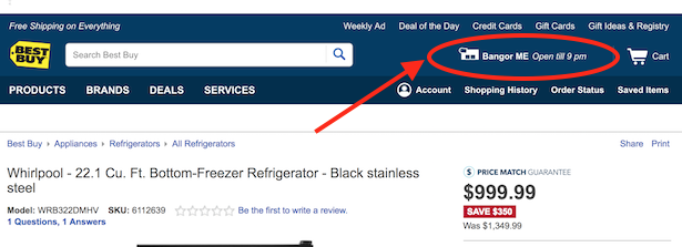
Best Buy uses a store icon in its header and tells me where my closest shop is located, as well as its opening hours for the day. This is a great idea for a store that sells considered purchase electronics and white goods, where the customer may want to see the item on display before they make a purchase.
2. AO.com – category slider
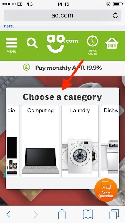
This may well be my favourite bit of UX on any website anywhere. On AO.com’s homepage I don’t have to scroll down to find a content block which corresponds to televisions, nor do I need to open the hamburger menu and look around, I can simply use the gorgeously chunky category slider smack bang in the middle of the page.
3. Booking.com – sticky search widget
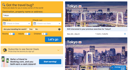
For an online travel agent, by far and away the most important part of the homepage is the search widget which users will use to define their vacation and find aggregated results. This search box needs to be visible at all times.
Booking.com uses a sticky search widget, which stays pinned to the top of the homepage as you scroll, meaning users can have a look at content below the fold without forgetting the point of the exercise.
4. AO.com – track order button in header
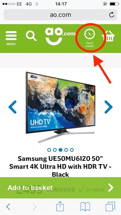
A great customer experience is what makes AO.com stand out, and that extends far beyond the sale to a great delivery service, product warranties and the like.
This much should be obvious by the AO.com header on both mobile and desktop, with a track order button being given as much prominence as the basket and the menu. The visibility of this button will reduce call volumes and keep customer’s satisfied.
5. Rentalcars – sign-in prompt
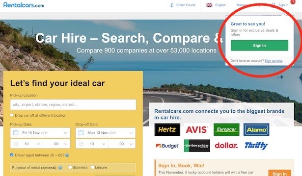
Rentalcars is in the same group as Booking.com, so you won’t be surprised to learn it’s a master in the art of persuasion on an ecommerce page.
Sign-in is all important to ensure Rentalcars knows customer email addresses and can add them to the sausage factory of marketing automation / personalisation. Accordingly, I get a ‘Great to see you!’ message flash up with call to action to sign in. The promise of ‘exclusive deals & offers’ ought to gently push me along, too.
6. Rentalcars – booking incentive at sign-in
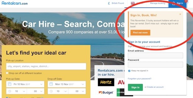
And to doubly make sure my momentum is carried through, once I click on Rentalcars’s sign-in button, I’m given another incentive above the email and password form fields: “This November, 5 lucky holders will win a free car rental.”
All I have to do for a chance to win is sign in and book.
7. Argos – value proposition banner
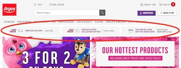
Argos has the best banner in all of retail (IMHO) when it comes to explaining delivery, pickup and credit options (a big part of the Argos proposition). I can see same-day delivery pricing, in-store collection pricing and timeframe, and Argos card APR. Despite the smaller screen size, these messages show on mobile, too, gently fading in and out.
This banner is vital for those customers who may not know that Argos offers such speedy fulfillment or flexible payment.
8. Lush – immersive header menu
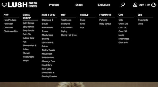
A header menu can be a confusing thing. To allow users to concentrate on the options available in the menu, retailers such as Lush use a full-page menu which takes over pretty much the whole screen. I love this signature black and white design, and the vertical category lists. No messing about.
9. Argos – Eye-catching promotional categories
I love the way Argos draws attention to its seasonal and popular products with these colour swatches that sit above the relatively muted mega-menu. A great way to suck users in throughout the entire site, without relying on them landing on the homepage and clicking a content block further down the page.

Search
10. Rentalcars – informative loading
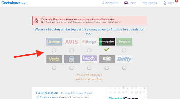
Waiting is horrible. Rentalcars uses this clever multi-logo loading graphic, which lessens the user’s frustration as they can watch as progress is made sourcing all of the different quotes they need. Who knows if the timing of the little green ticks actually correspond with what is happening behind the scenes?
11. AO.com – popular product thumbnails in search
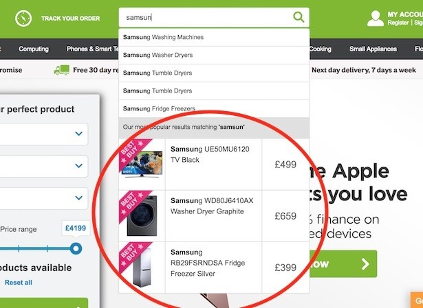
This is nothing particularly new to ecommerce, the use of suggested search which updates as I type. However, the inclusion of popular products, ‘best buys’ in this case, which have a clear price and also update as my search term changes is a nice touch. This epitomises AO.com – best practice in action.
12. RS Components – categorised search suggestions
For product search buffs, RS Components is the retailer that will really get you excited. That’s because the B2B supplier has an enormous catalogue of very complicated products which creates obvious difficulties in search.
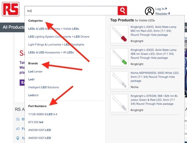
Here’s one way RS seeks to help the customer. It separates my search results (in this case for ‘LED’) into product categories, brands and even part numbers (some customers will know the number of a part they want). There are also top products on display here, much like the AO.com example above.
13. RS Components – popular category results
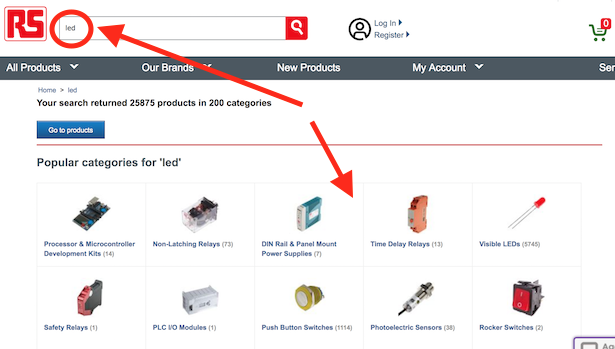
Here’s another way RS helps to narrow down my search results. Once I hit return on my ‘LED’ search term, I’m told that there are more than 25,000 results in 200 categories.
In order to prevent me from trawling so many products, RS prompts me to choose from a popular category, offering me a smaller selection of 10. I can click the button to ‘go to products’ if I insist on wading through everything.
14. Airbnb – search as homepage
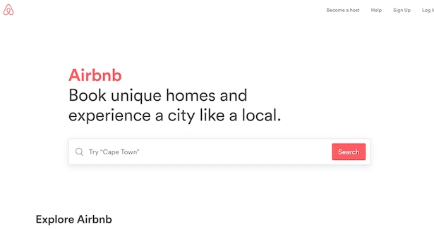
I thought I should include something esoteric, so here’s Airbnb’s homepage, which like Google is simply a search bar. Yes, there is some content beneath the fold, and a few little links in the top right, but this homepage sets the tone for Airbnb’s whole experience and brand. It’s about dreaming of where you want to go.
Okay, perhaps not that transferable to ecommerce more broadly, but still worthy of appreciation.
15. Airbnb – search with embedded menu
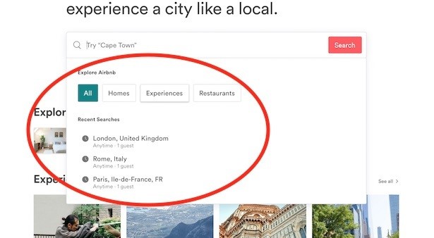
I’m not sure I’ve seen this done anywhere else. Correct me in the comments if I’m missing an obvious example. Before I type anything into Airbnb’s search box, I get a drop down which in effect contains the header menu that the homepage lacks – there are buttons to explore different products (homes, experiences and restaurants), as well as a handy list of my recent searches.
These explore buttons are mirrored further down the page in content blocks, with Airbnb intent on giving the user more than one path to reach the content they need.
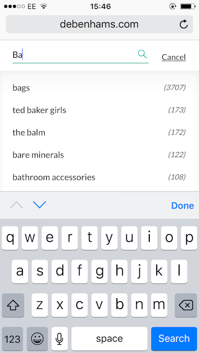
16. Debenhams – search suggestions and results as you type
There’s one thing to note here which the previous AO.com example didn’t include, and that’s the use of product frequency in suggested search terms. This makes the user aware of just how many results they’ll discover when they click through any given term.
This is standard practice now and retailers such as ASOS have done this for a while. The suggestions themselves are usually based on aggregated user behaviour and optimised algorithmically.
17. AO.com – product selection guide
This isn’t strictly search as we know it, in that I am not entering a search term, but it serves a very similar function (or somewhere between search and faceted navigation).
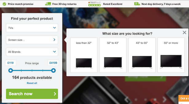
AO.com uses a dynamic product guide on its desktop homepage to help customers find the product that’s right for them. I’m asked a simple question about the product I need (such as screen size). As I state a preference for brand and set a price range, the number of product matches is whittled down and I’m left with a smaller selection to choose from. Great for honing purchase intent when users are bamboozled by too many options.
